ALGO
CLASSIC
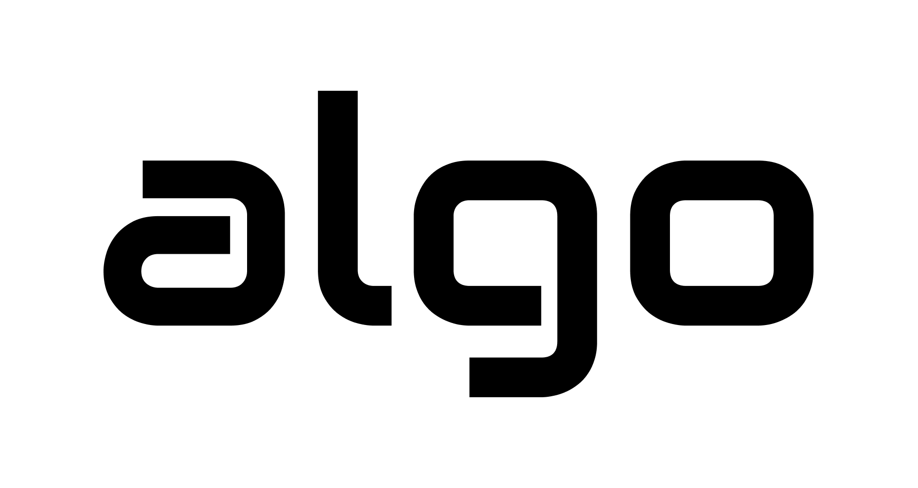
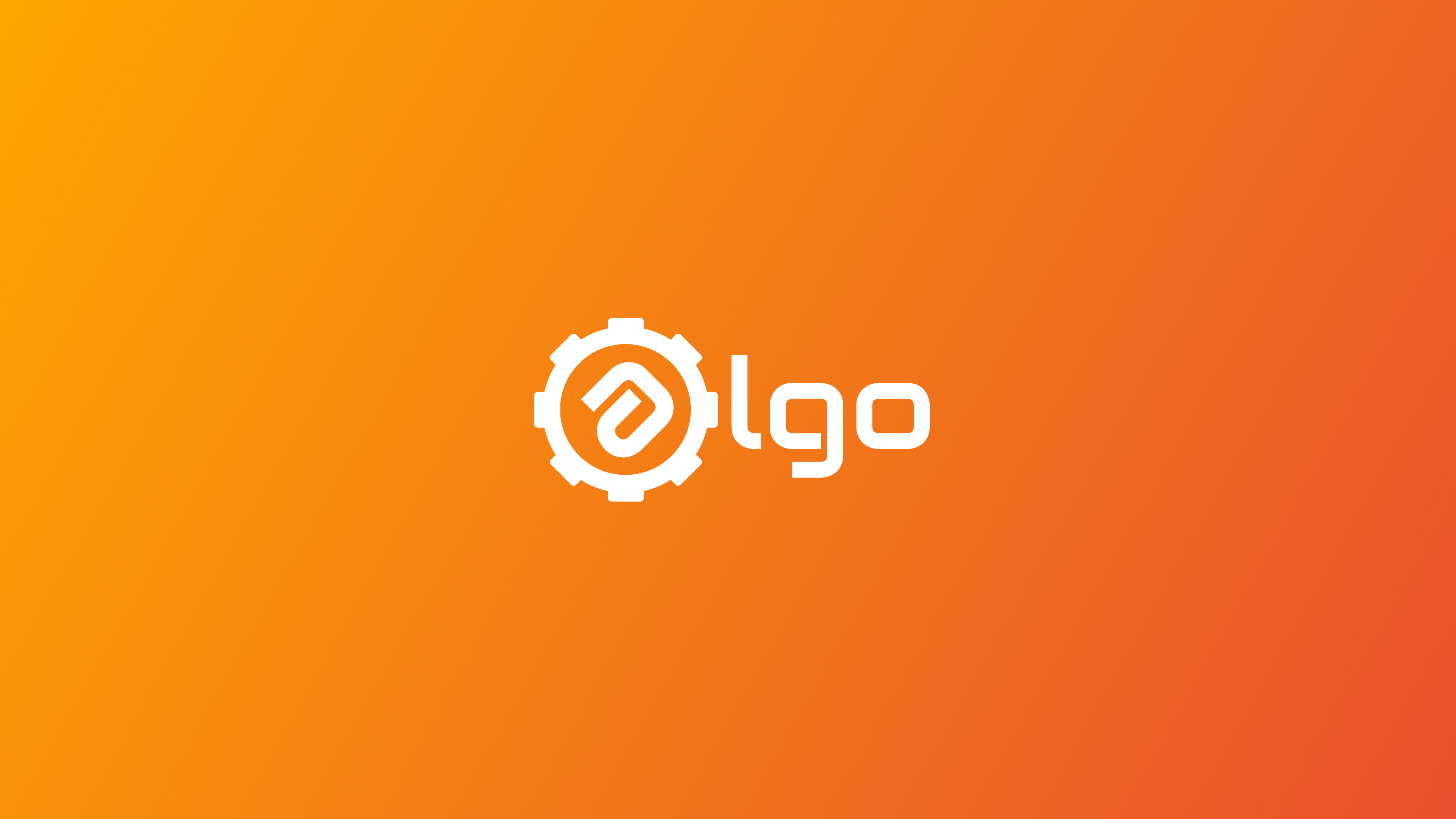
The original algo brand started with a simple goal. Written in sleek lowercase and styled with the sleek "Audiowide" font, algo was born to look like an indie video game studio. We quickly realized we weren't that serious about the business, algo was mostly a joke.
But something cool happened next. Instead of fading away, algo became a special symbol for a group of people living far apart. It grew into a fun reminder of the good old days. Once a year, I bring the algo design back to life, giving it a fresh new style each time as a creative ode to our past.


MODERN
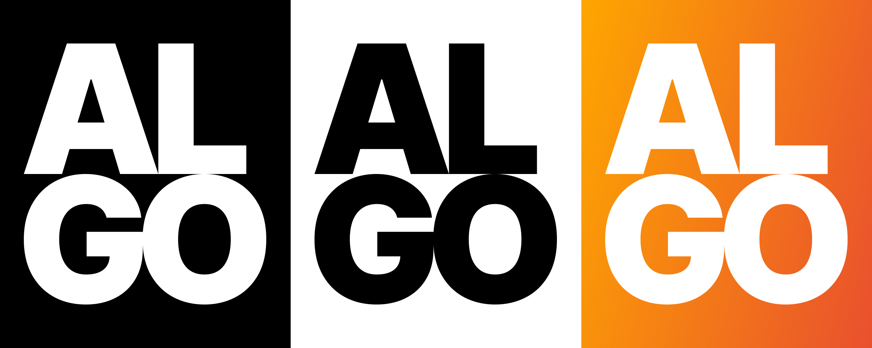
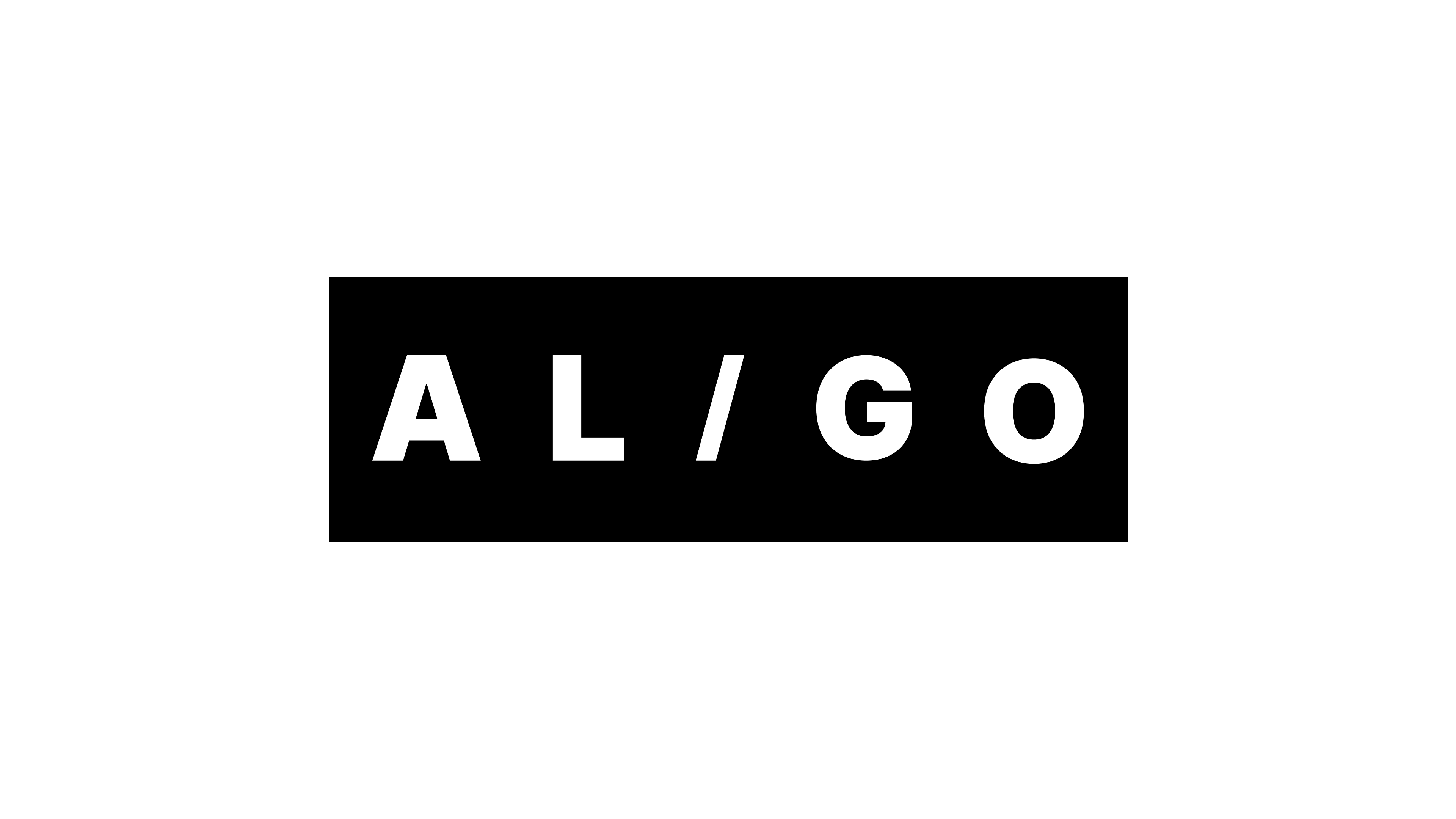
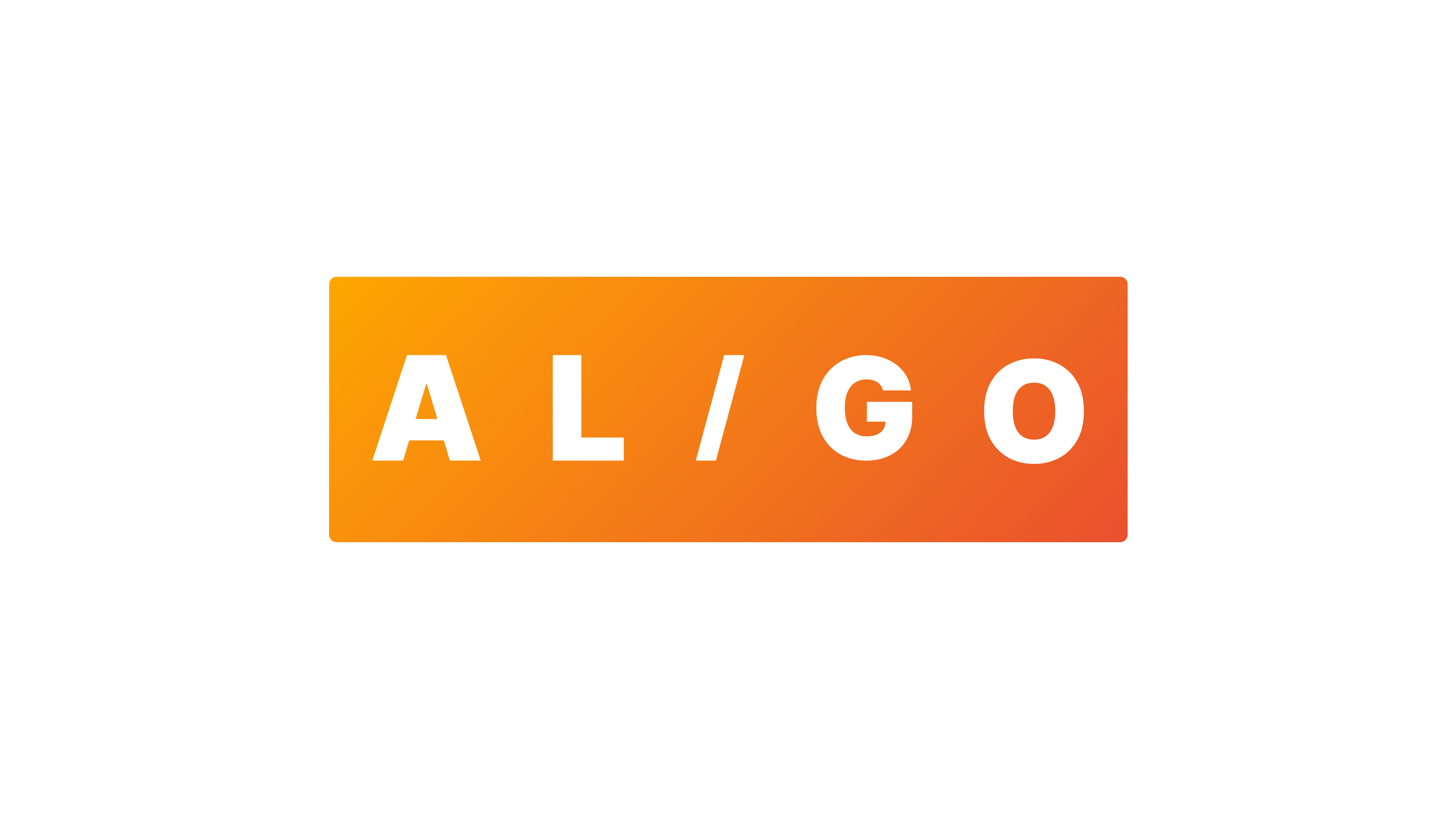
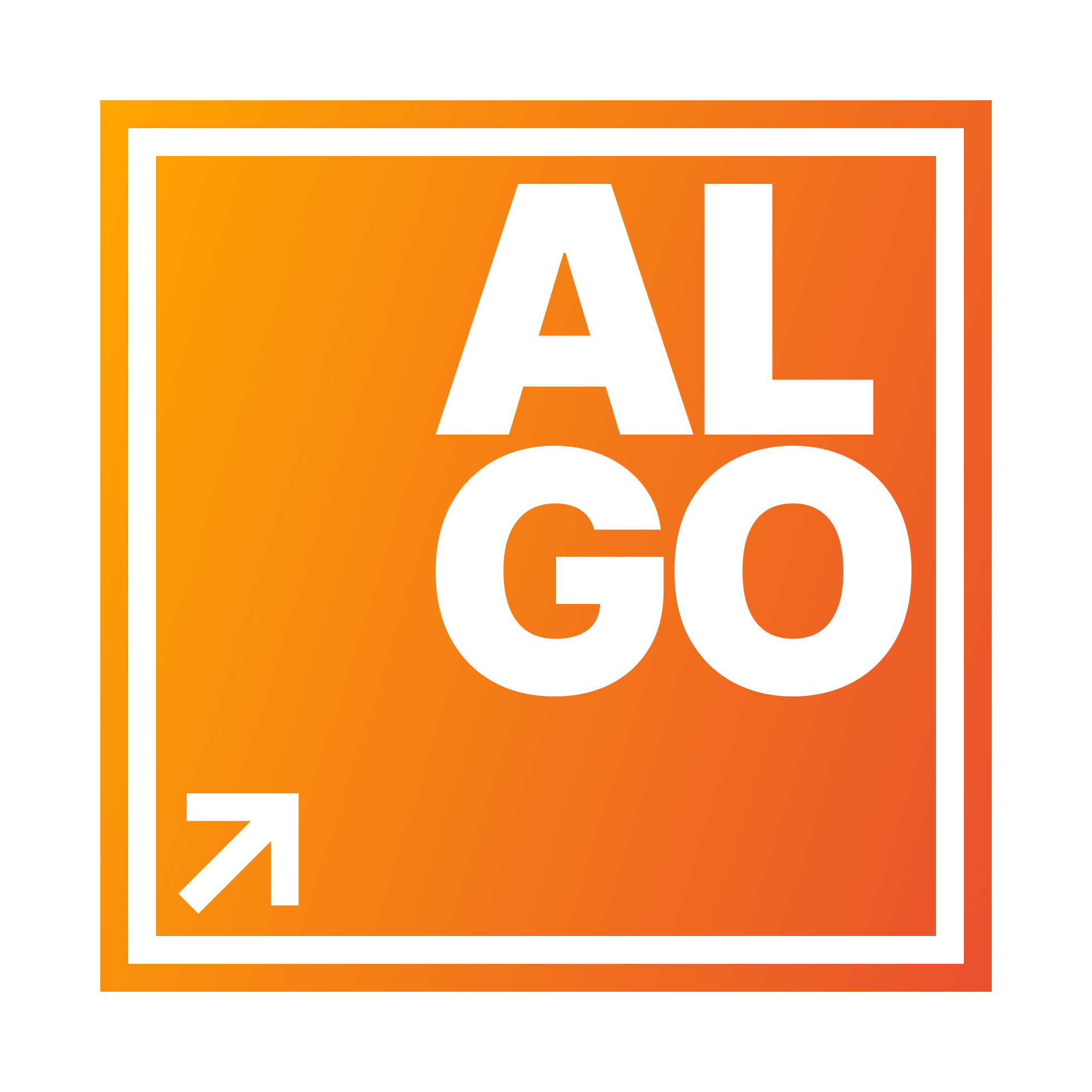
For Year 2, I gave the logo a modern upgrade. I switched to bold lettering and dropped the lowercase style to give it a more vibrant, strong feel. I also removed our iconic gear to create a cleaner, minimalist design.
ALGO RHYTHM
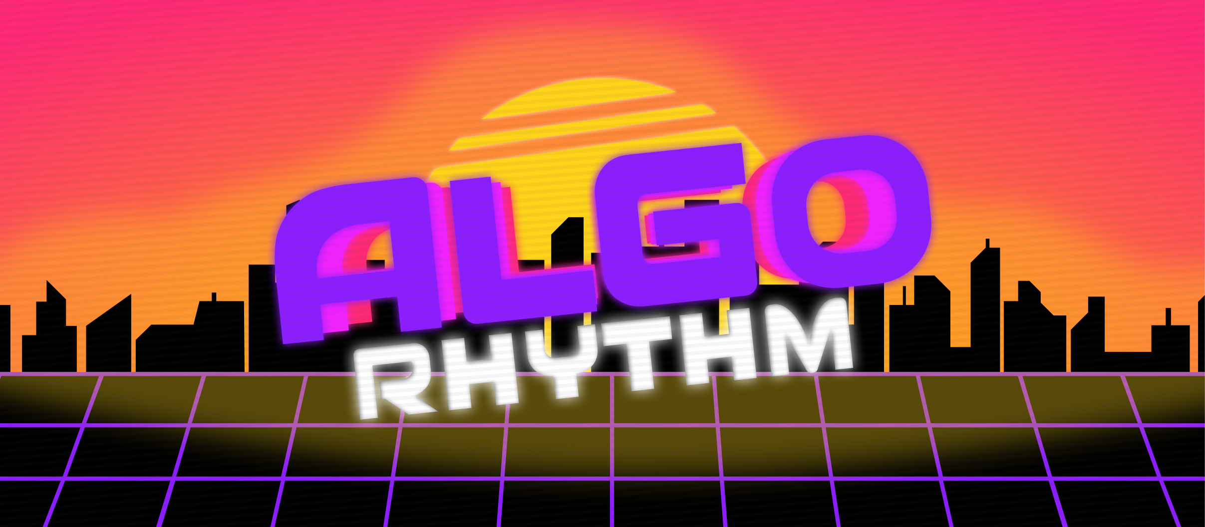
For Year 3, I took a much bigger leap. I fully embraced synthwave vibes to turn the brand into ALGO RHYTHM, a playful nod to classic rhythm games. The design is meant to exude motion, with the text popping out. Nothing seemed more fitting then to juxtapose that electric, vibrant mood with an attempted 1:1 remake of the very grounded classic Windows 95 aesthetic.
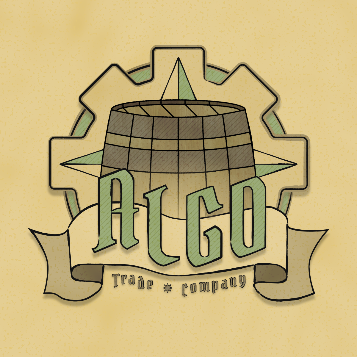
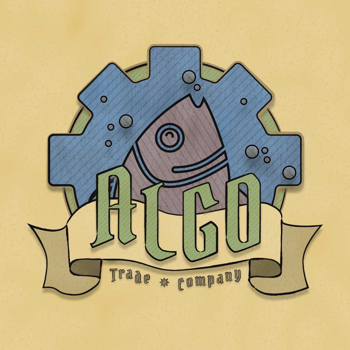
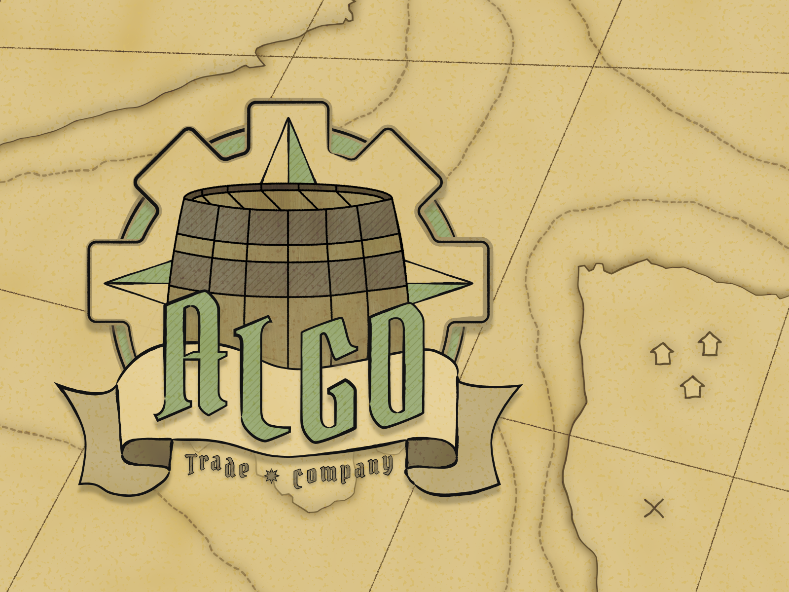
SEA ALGO
For no particular reason, algo was reborn as the old-timey ALGO TRADING COMPANY. I took a massive departure from the previous digital moods by introducing a tactile, papery texture. As a fun detail, I brought back the classic gear icon, which brings the whole design together.